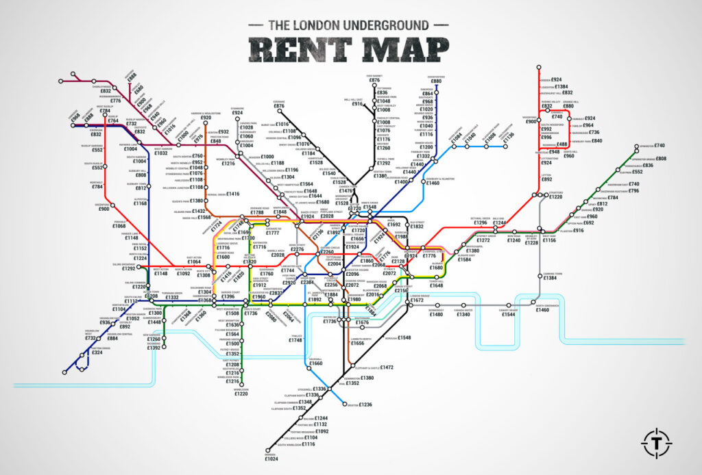
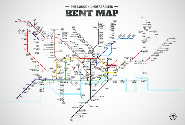
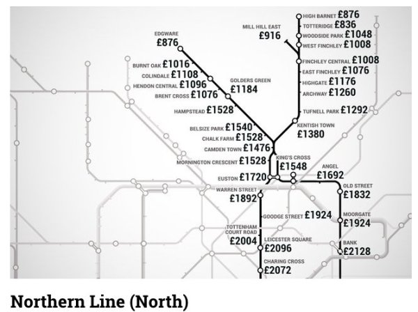
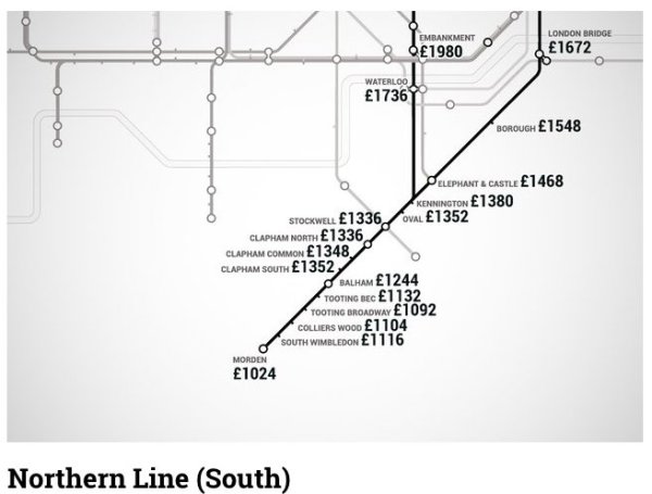
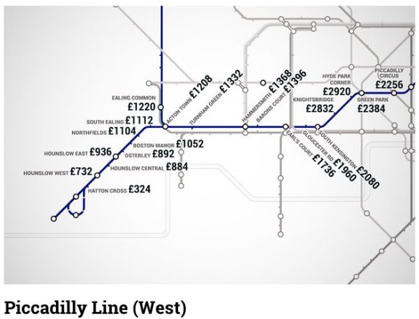
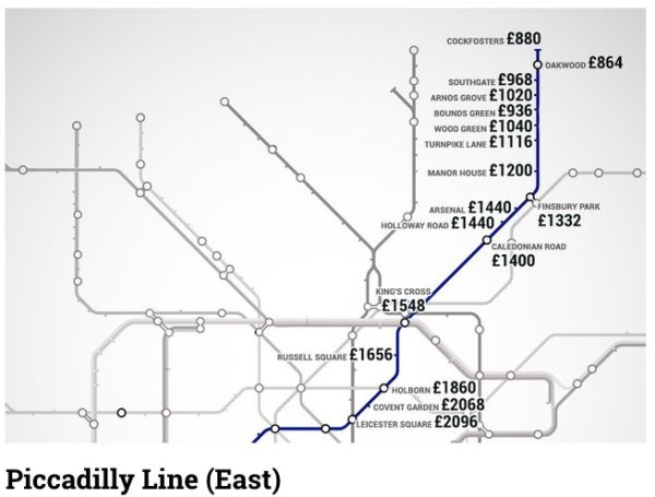
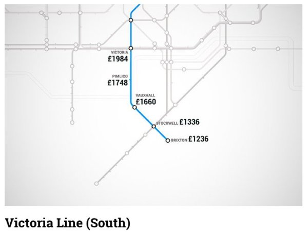
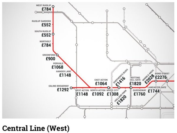
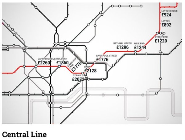
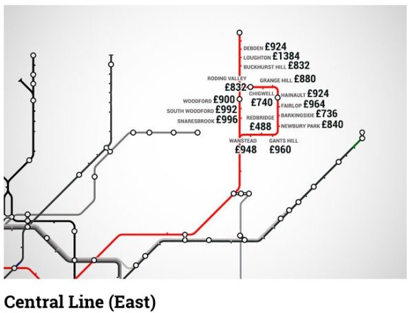
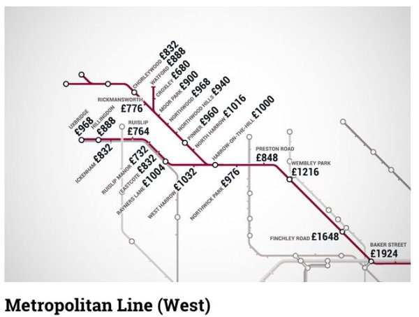
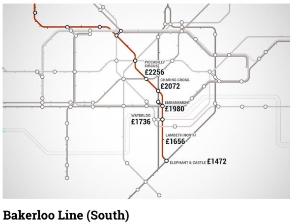
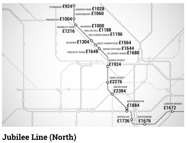
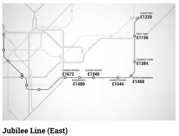
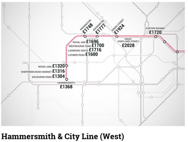
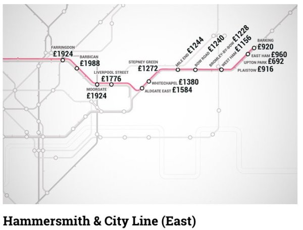
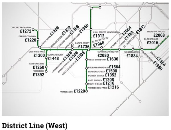
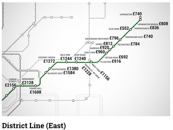
Unless you’ve got A LOT of money then this tube map appropriately named the ‘Rent Map’ makes for some pretty sobering viewing. Put together by Thrillist with the help of Find Properly the part infographic part Tube map lists just how much it will cost you each month to rent a property at that particular stop.
Each of the figures reflect how much a one-bedroom property will cost within a kilometre of each Tube station. It probably doesn’t come as much of a surprise then that the closer to central London you get the more an apartment will set you back, but yet it’s still pretty fascinating. Take a look below to see each line in detail.


Source: thrillist.com
h/t huffingtonpost