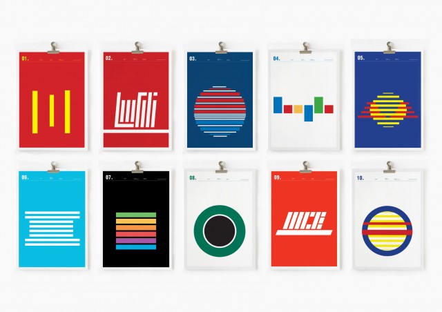
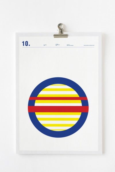
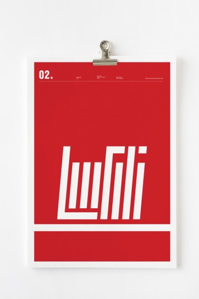
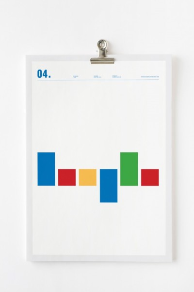
Art director Nick Barclay wanted to see whether or not he could simplify some of the worlds most famous brand logos and make them still recognisable. Using rectangular and circular shapes he presents to us a simplified version of logos such as IBM, Burger King and Google.
The purpose of the project titled ‘Line Logos’ was to see how “engrained in our psyche” these logos have become. The fact that they are all easily recognisable even in their simplest form answers that question. You can see more of Barclay’s work over on Behance and his website.
Apple

Burger King
Coca-Cola
IBM
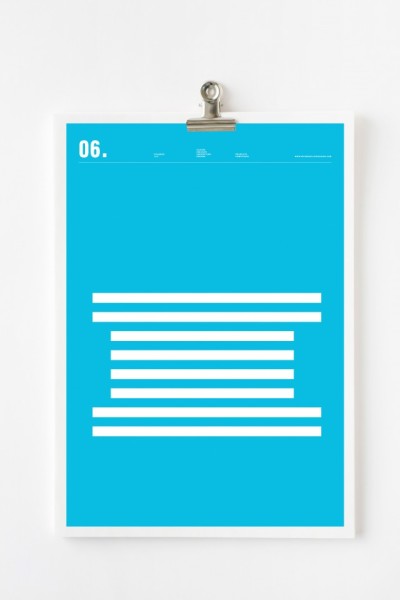
Mc Donalds
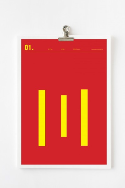
Nike

Pepsi
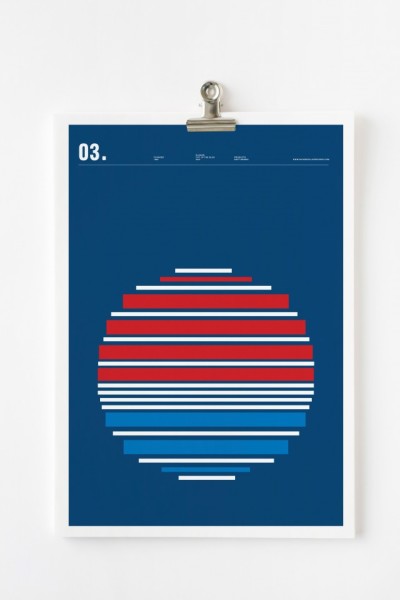
Redbull
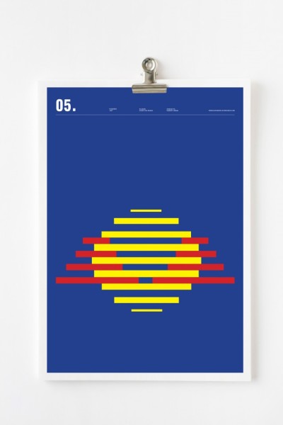
Starbucks

Source: nickbarclaydesigns.com
h/t fubiz.net
