The logo for any company is the first thing that a new potential customer see’s and when they’re this bad it really isn’t good for business. Here are the 15 worst co
1. When it was released the London 2012 Summer Olympics logo received a lot of criticism from press who claimed it looked like Lisa Simpson performing a sex act, a punk swastika and according to the Iranian government it spelled out the word ‘zion’.

2. Brazil’s Federal University of Santa Catarina’s Institute of Oriental Studies tried to create a Japanese temple style logo with a rising sun backdrop. Although it turned out more like a butt. They quickly took it down after it went viral online.

3. Kostelecké uzeniny is a Czech sausage company established in 1917. Their logo has never been changed since. It’s clear why those unfamiliar with the logo find it so amusing.

4. Mont-Sat is a Polish company that installs satellite TV to peoples homes, albeit in a rather enthusiastic manor. They still use this logo.

5. The 1974 Catholic Church’s Archdiocesan Youth Commission logo. Looks well designed, until you look closely.

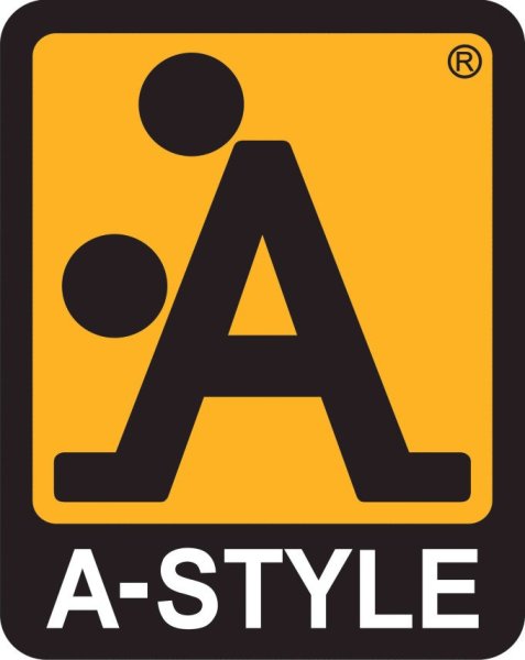
6. In 1991 the clothing company A-Style created a stylized ‘A’ logo that looked like two people having sex. They were in on the joke, but to this day people still think they did it by accident.

7. The State of Vermont brands all of its pure maple syrup, but their logo looks less of a state and more like a man violating a bin.

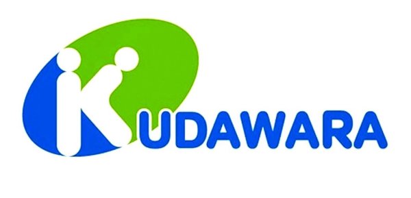
8. The Japanese company Kudawara Pharmacy decided to play around with the alphabet once for its logo, but this happened.

9. Despite this logo looking quite disturbing the Arlington Pediatric Center in Virginia does some amazing work to help low-income families. It may come as a surprise but they no longer use this logo.

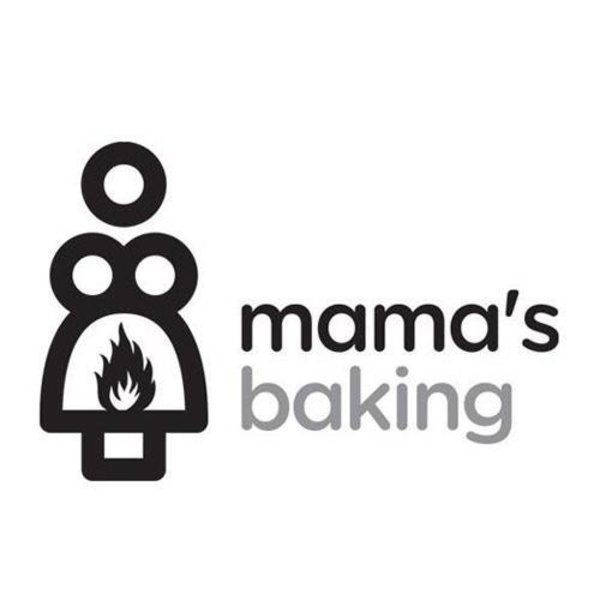
10. Mama’s baking, a bakery in Greece has decided to keep its logo even though it was mocked online. We aren’t even sure what it could be… other than what it clearly looks like.

11. The old sign about Kid’s Exchange consignment shop in Georgia goes to show just how important punctuation is.

12. You’d think that with access to computers the ‘Computer Doctors’ could get in contact with a better graphic designer.

13. This flyer for a local jazz dance class appears totally normal at first… but once you see the woman’s naked torso it’s forever ruined.

14. The British Office of Government Commerce revealed its sleek new logo in 2008, only for someone to flip it 90 degrees to reveal a man pleasuring himself. It was immediately scraped.
unveiled its sleek logo redesign in 2008,

15. MegaFlicks video rental store in a Florida shows why typography matters with this monumental mess up.

h/t theultralinx.com
