Proving once again that it matters when hiring someone to create product packaging, shop signs or just about anything that involves writing, these 17 hilarious examples stress the importance of spacing, or as designers like to call it, Kerning.
Some of these examples are doomed from the start thanks to their poor font choices, but others could have been rescued with some proper kerning, the process of spacing letters. Whilst some computers will adjust typefaces accordingly others don’t and this then leads to the terrible but hilarious disasters you see below. Also, if there’s one word that companies need to start trying harder at it’s the word “click” which is a recurring theme here.
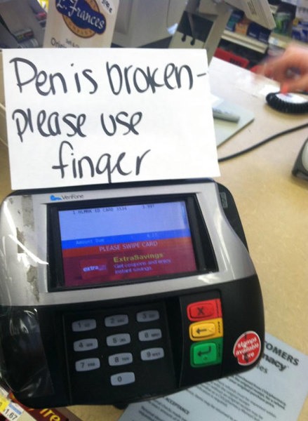
1. The kerning is a little off.
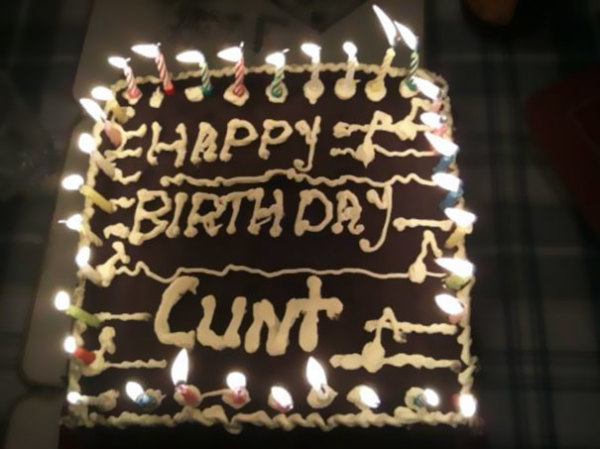
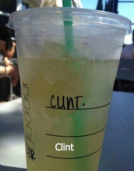
2. Clint’s birthday cake wasn’t the best that year.
3. The logical thing to do.
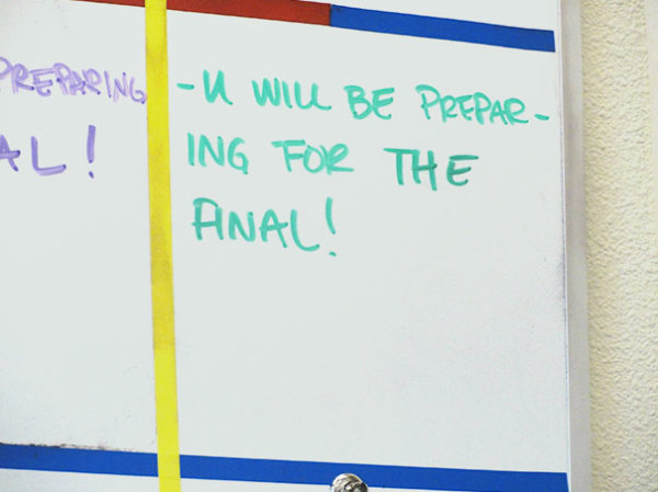
4. A math teacher that needs to learn about kerning.
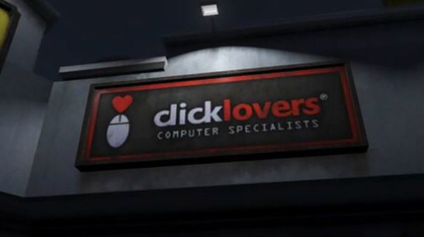
5. Taken from GTA, at least this one’s intentional.
6. A really bad font choice.
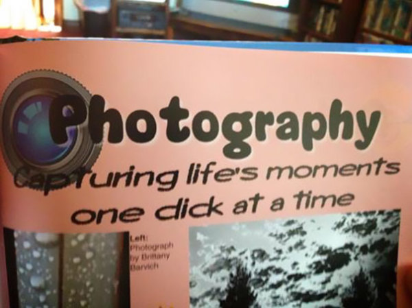
7. This insightful error.

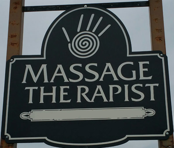
8. What sort of massage is this?
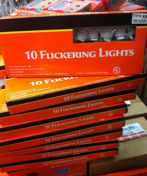
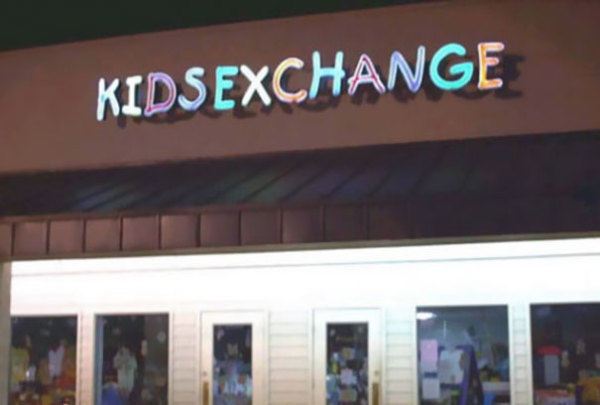
9. Spacing matters… a lot.
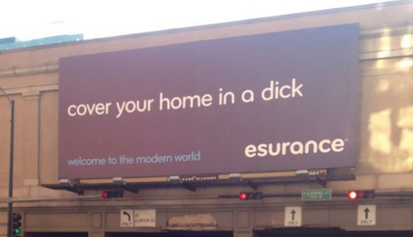
10. An enticing offer, but we’ll pass.
11. Starbucks doing what they do best.
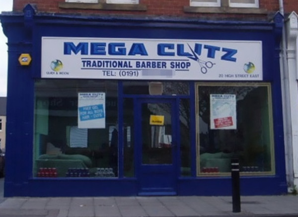
12. Traditional barber shop.
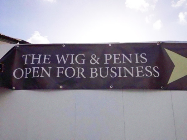
13. Just a simple tap of the space bar would do.
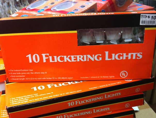
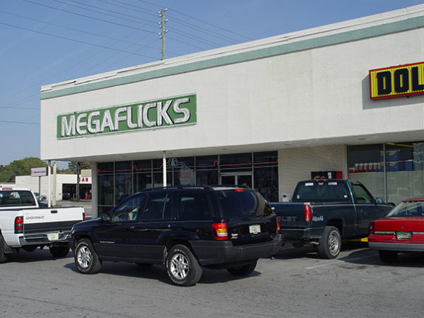
14. Megaflicks.
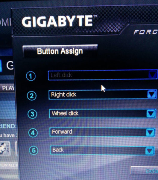
15. Well played Gigabyte.
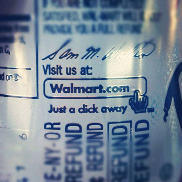
16. Walmart, check your kerning!
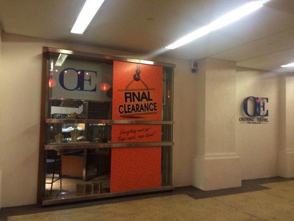
17. Finally, this clearance.