2016 saw a lot of big logo changes from some of the world’s biggest and best known brands, from the likes of established companies such as Kodak to more recently founded companies such as the social media platform Instagram and Deliveroo, the online food delivery company. A strong individual identity is an important factor for any company and a complete change is a bold move that’s sometimes met with controversy – just as some of these logo redesigns were.
1. Instagram
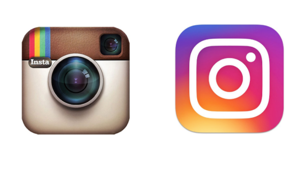
In reference to the many coloured filters that the Instagram app has for photo editing the social media platform ditched its retro looking camera for a cleaner, far more vibrant version. Although the new design was met with some criticism the overall response was largely positive and inspired a wave of creatives to make their own.
2. Netflix
Since it was founded Netflix has stuck with a text logo but as its become more established it’s since decided to change to a simple ‘N’ that appears to be folded, creating the optical illusion of depth.
3. Mastercard
Established in 1966 Mastercard is a global technology company that mainly specialises in credit cards and transferring money between banks. The ethos behind its brand identity change in 2016 was to simplify, modernise and optimise the company for the digital world.

4. Uber
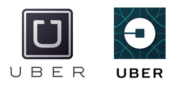
Uber’s recent logo change was inspired by the Introduction of UberRUSH. Originally an on demand taxi service it has now branched out into deliveries and the logo change is supposed to reflect this.
5. The MET
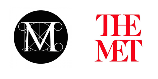
Perhaps one of the most controversial changes on this list The Met’s logo redesign received a mixed reception after it remained unchanged since 1971. Formerly known as the Metropolitan Museum of Art the museum is now known as The Met thanks to its typographic logo with the two words stacked on top of each other. Described as a “graphic misfire” and even a bush crash by New York magazines Justin Davidson, we’ll leave you to form your own opinion on this one.
6. Deliveroo
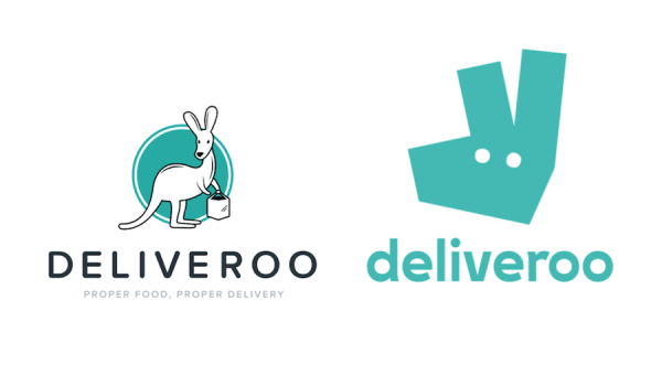
Founded in 2013 Deliveroo is a British food delivery company that operates in more than 84 cities across Europe and Asia. The new logo is described as an “evolution” of its original as it still keeps its teal colour but features a more simplified kangaroo illustration and ditches its tagline.
7. Kodak
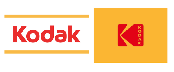
A retro flashback – Kodak decided to get old school with its logo in 2016 with a variation of its “Kodak K” logo that was first introduced in 1971, the main difference being that this time the word Kodak is written vertically instead of horizontally.
8. Mozilla
Mozilla, the popular web browsing client got a logo redesign from graphic designer Johnson Banks with the help and critiquing of internet users. The end result is an evil looking logo that certainly packs a punch.
9. Budweiser
Founded in 1876 the logo for the America beer Budweiser has changed a lot over the years with the last redesign occurring back in 2011. The latest redesign however has done away with a lot of the logos complex details and is instead a stripped back version that still uses the famous ‘bowtie’ shape.
10. Pitchfork
Although the change is minor the American online magazine launched in 1995 decided to ditch its previous type face and go with a more serif-styled font that also does away with the two pitchfork like points on the letter ‘k’.
