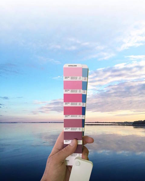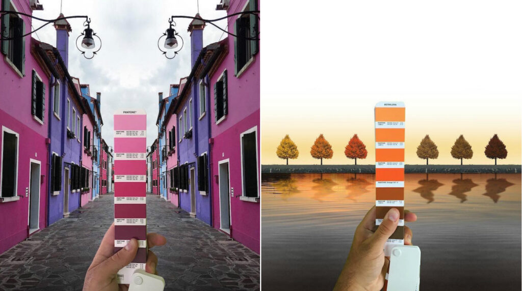
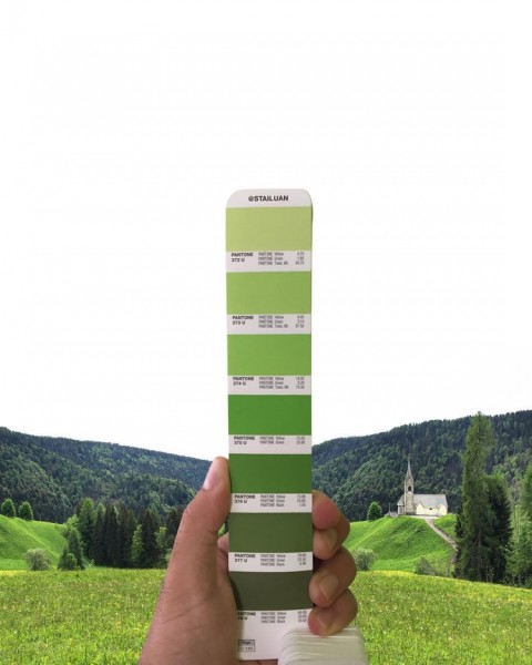
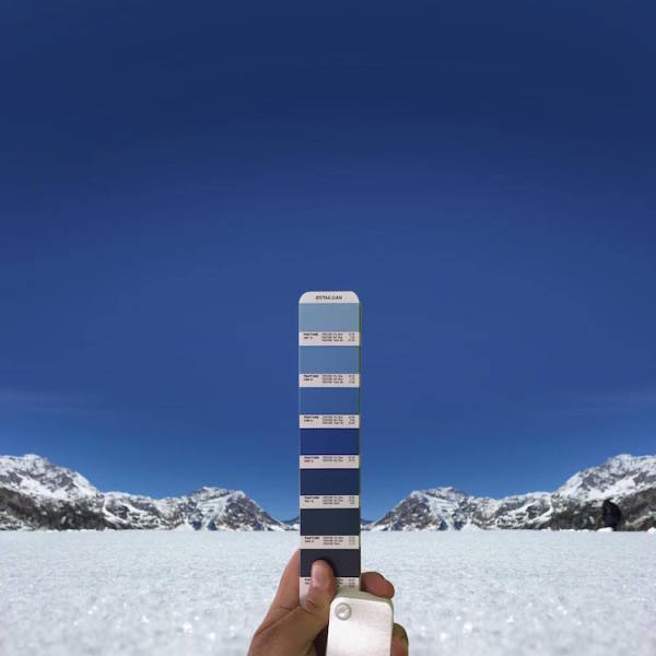
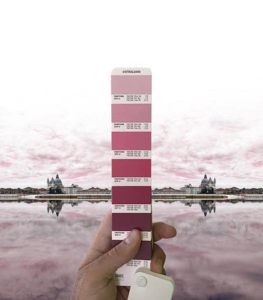
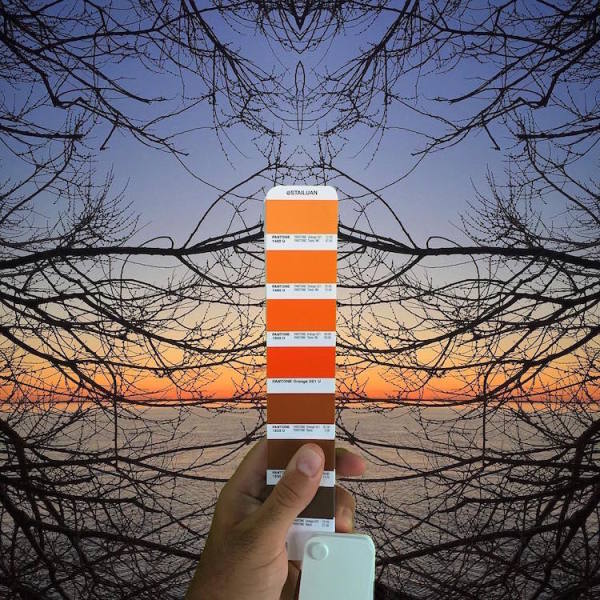
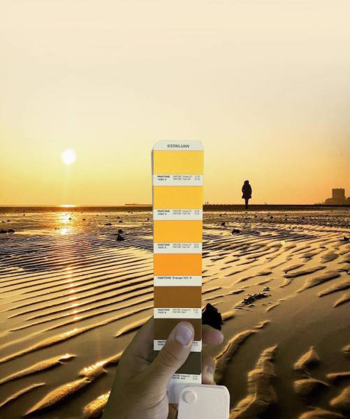
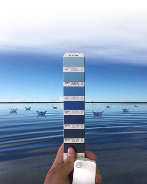
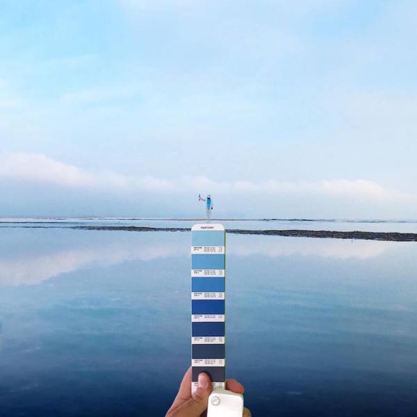
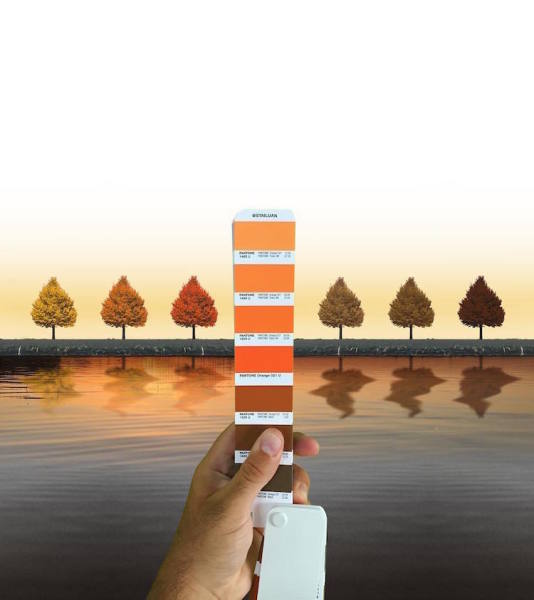
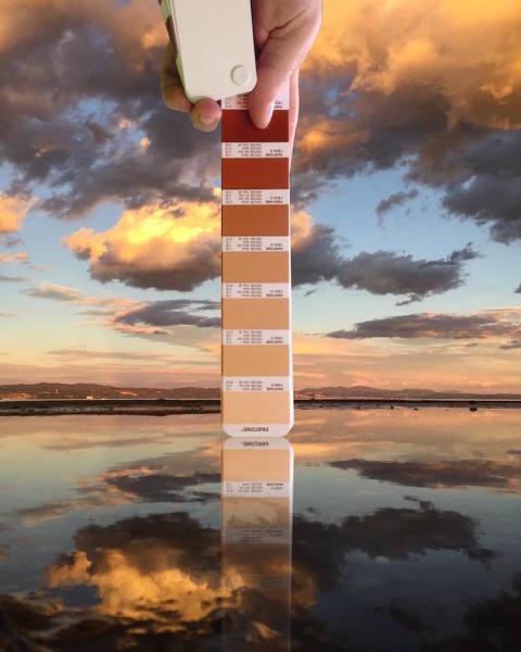
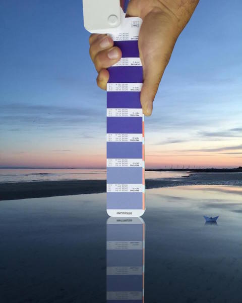
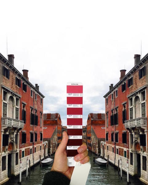
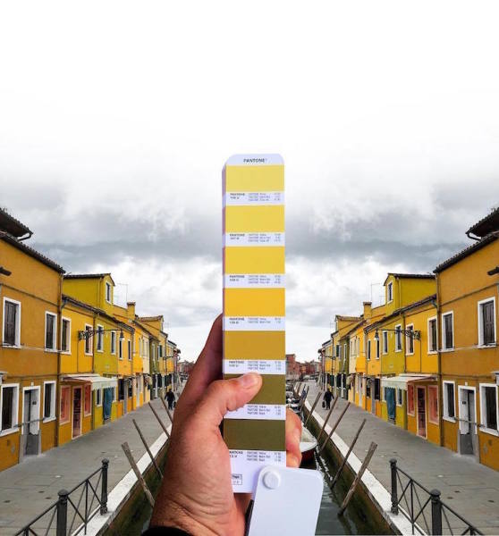
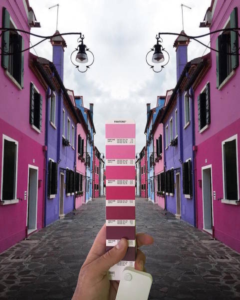
Although not the first to put Pantone colour swatches to creative use other than there intended purpose, Italian graphic designer Andrea Antoni demonstrates his eye for matching colours in this rather satisfying series in which he matches Pantone colours with photographs of landscapes, sunsets and city streets.
For each of his photographs the designer holds up a strip of Pantone swatches that are arranged into a glorious gradient matching their backdrops, whether it’s a sunset across a lake that fades from blue to orange or a vibrant street full of purple or yellow houses.
You can see more of Antoni’s Pantone photo series over on Instagram as well as see more of his work on his website and Facebook.
1.
2.

3.
4.
5.
6.
7.
8.
9.

10.
11.
12.
13.
14.
15.
16.