In his series “Power of Brands – Minimal Logos”, artist Pedro Almeida challenges you to look at the minimalist version of a brand logo and see if you can make out what brand it actually is. Do you think it is easy to do that when the brand logo has been stripped down to the bare minimum, block colours and basic shapes? Find out below!
Why would an artist do this? “I wanted to emphasise the value of creating a logo that would leave a memorable impression. Visual communication is the easiest and most important way to communicate, it should be easy, that is the graphic designer’s role”, said Almeida. I incline towards the same opinion as Almeida. I think visual memory is really powerful and once your brand is part of a person’s visual memory, they kind of stay there forever. Like the McDonald’s logo which for me is one of the most powerful logos out there. Maybe it is so because it has been around for quite some time and you see it everywhere. Or maybe it is so because they know how to make use of their golden arches so good so that they are iconic, recognizable, they’re theirs.
Keep it simple
One key point when creating a logo is keeping it as simple as possible so that it can be easily saved on your hard drive and stay there until your hard drive is activated by another sight of the logo, another “meeting with it”. So, it was quite tough for Pedro Almeida to remove a little more from these logos and still keep them on the limits of being recognized by us. If people can still recognize a logo just by block colours and a simple shape then it means that the logo is here to stay in our collective memory forever.
Pedro Almeida’s little experiment can also be useful for young graphic designers currently at work on various brand logos. Maybe if you’re one of them, you can try a little exercise. Strip down the logo you’ve just created to the bare minimum: colours and simple shapes and see if it still makes sense.
At the end of the day, no matter what you say or do, people need to see you, or an image of your brand. The book says that the logo needs to encapsulate your whole brand’s identity, but I think it just needs to stand out from the rest, to be there in your face whenever someone interacts with your brand, to ring a bell whenever someone sees an Ad with your logo on it. You know, to be pleasurable on the eyes, easy to recognize, to be “home” after you’ve driven for 3-4 hours in unknown territory and then bam, you see a McDonald’s logo, you know you’re “home”, you know you know something about that place.
Usually, people find it hard to even imagine their mother’s face, to visualize it just from memory. So why would they remember a super complicated logo brand, right? That is why “keep it simple” is the best advice there is out there. On the other hand, the biggest brands on the planet have been so in your face, hitting you with their “faces” (aka logos) everywhere that it might be easier to visualize McDonald’s logo in your memory than it is to imagine your mother’s face. How about that? A little bit sad, right?
Anyways, now it’s time for Pedro Almeida’s reimagined minimalist logo designs. Can you say which is which?
1. Twitter

2. Samsung

3. Leroy Merlin

4. Continental Tires

5. Lacoste

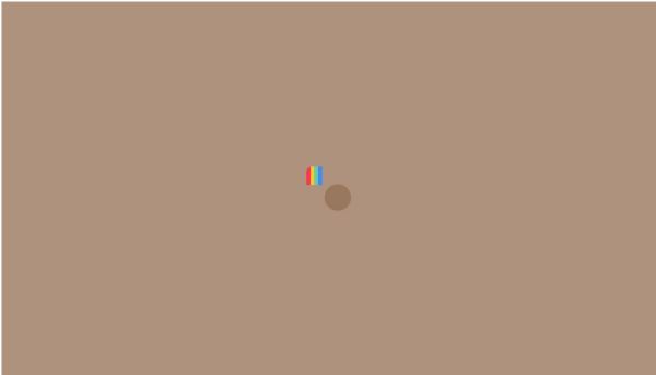
6. Instagram
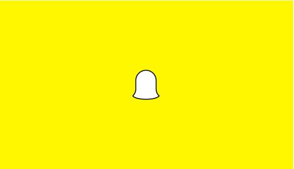
7. Snapchat
8. IBM

9. Domino’s Pizza

10. Starbucks

11. Volvo

12. FedEx

13. Youtube

14. Amazon

15. eBay

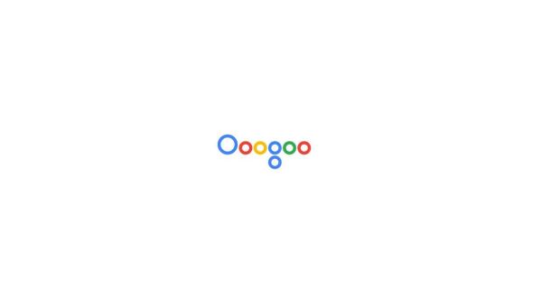
16. Google
17. Vodafone

18. Shell

19. BMW

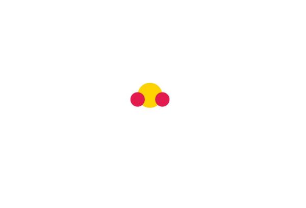
20. RedBull
21. Netflix

22. Pizza Hut

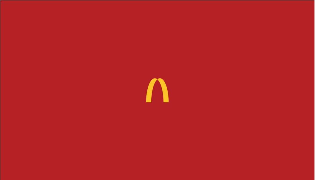
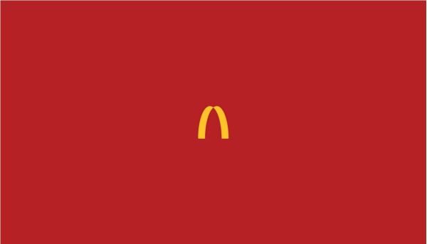
23. McDonald’s
24. Apple

25. Playboy

Via Pedro Almeida