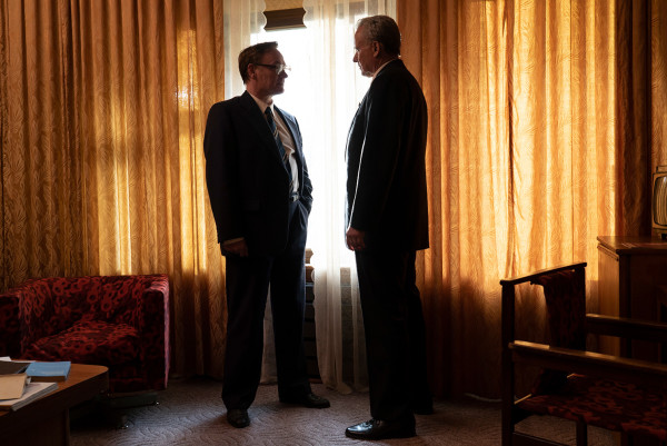
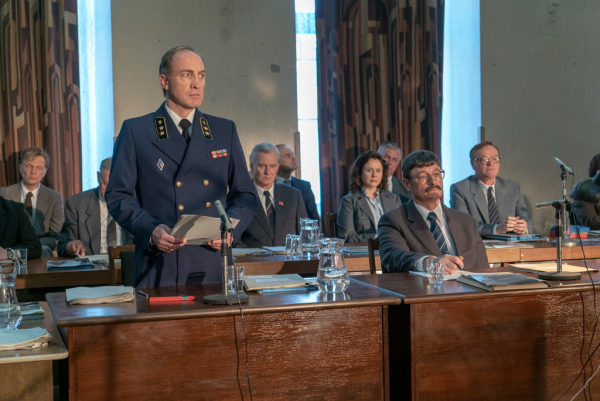
The Chernobyl TV series has taken our world by storm with its unique way of telling the story of one of the biggest nuclear disasters on the planet. And one part of its uniqueness stands in its chilling set designs which really made you feel your were in the 80s Communist era of Ukraine.
While it has its detractors who claim the series has gone a little too far in portraying the dangerous side of nuclear power and the secrets and lies of the Communist rule, the TV series was widely acclaimed and now stands at the top of IMDB’s all-time list of best TV series ever. Quite a performance!
To really understand a little bit of Chernobyl’s magic, we need to look at the interior designs in this movie and one of the men behind them was the production designer Luke Hull.
“We looked at photographs, some YouTube videos and a lot of street and life photography books from the time. The other side of things was to find a reference that built a sense of the tone, dread and mood in the five episodes. I looked at the work of Alexander Gronsky – notable for his Russian landscape photography known for their quiet and abandoned qualities – and Gerd Ludwig – a photographer who documented the aftermath of the disaster – in the early stages and it helped to encapsulate a look”, says Luke Hull.
Let’s see a little bit of the ‘magic’ and how it was created!
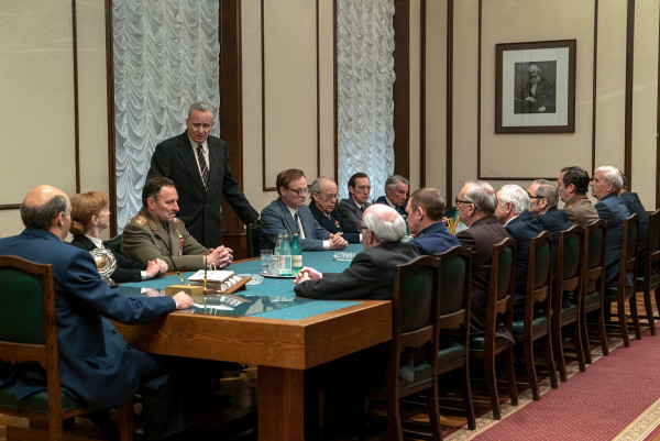
1.

2. Pripyat was actually a combination of a lot of similar towns quickly built to service the power plant
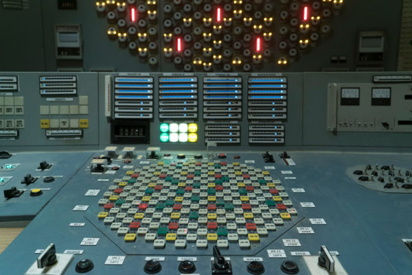
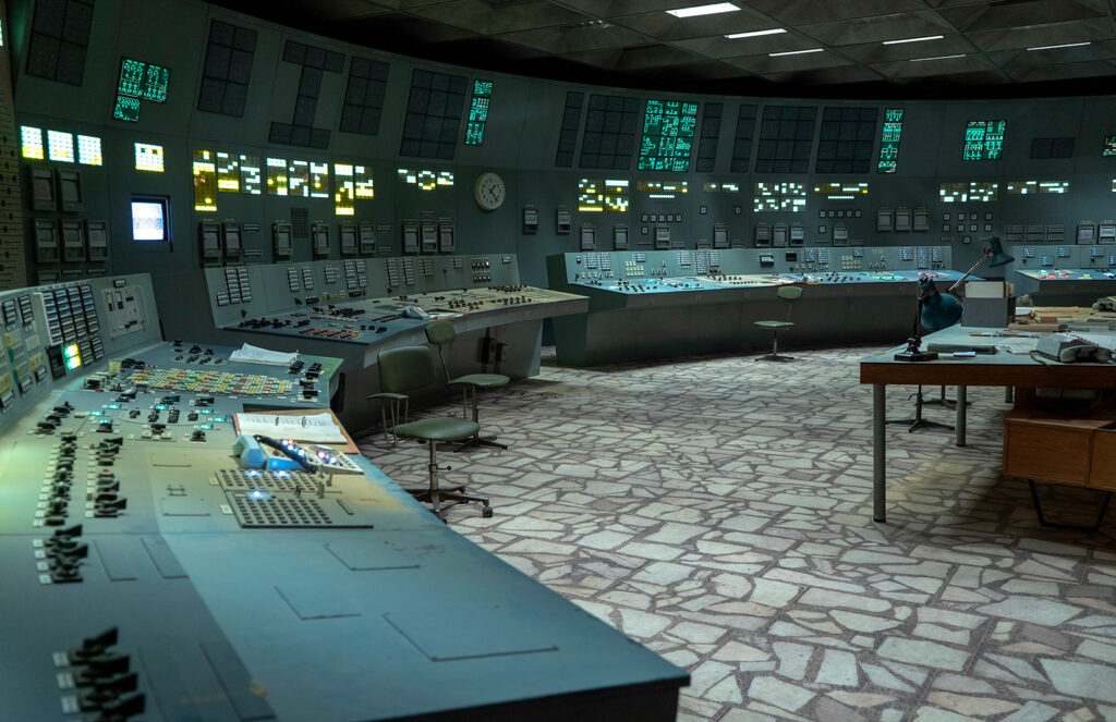
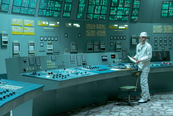
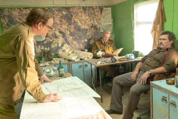
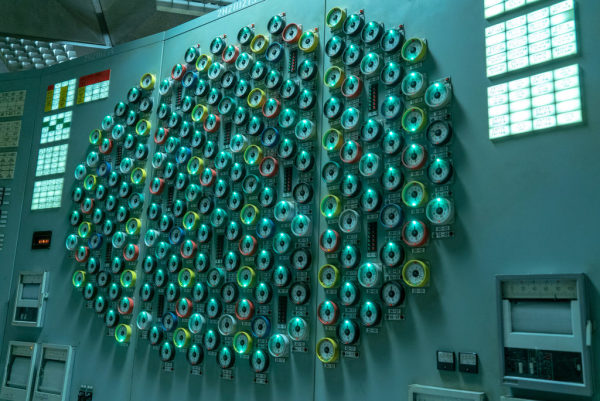
3. The entire control room of the reactor was built from scratch, on a stage
The reactor 4 damage scenes were recreated on a set in Lithuania, almost from scratch
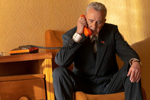
4. The telephone and the hospital equipment is very Victorian-looking if we think the movie was set in the 1980s, showing the slow advancements in the Soviet Union when it came to commodities
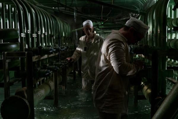
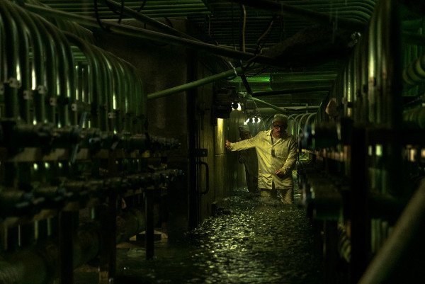
5. The divers underwater scene set was not a realistic interpretation of the actual underwater tunnels of the reactor , but it help build that tension, fear and extreme confusion in the air.
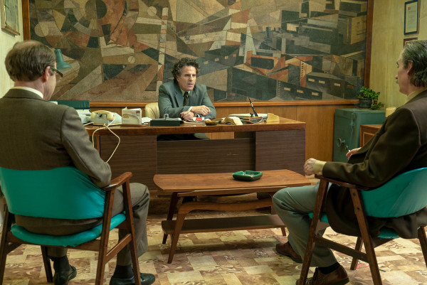
6. The mural in Bryukhanov’s office represents a maze of stairs and corridors lost in chaos and the parts of a power plant in complete disarray. They design speaks for itself.
7. Confusion, fear, isolation, panic and horror
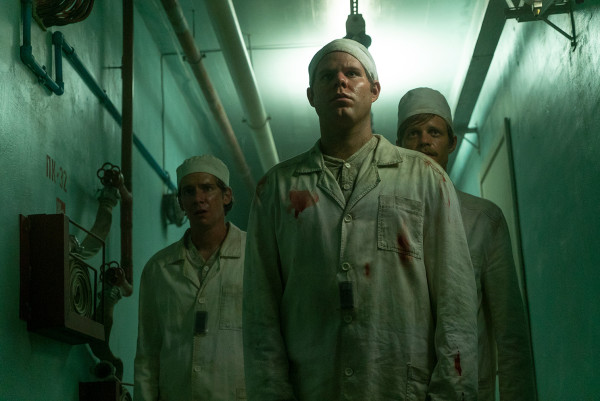
8. The Communist era was a bit gloomy, and one of the reason is the lack of electricity from the Soviet Union. The producers of the show wanted to replicate that feeling and used fluorescent lamps. The color palette of the plant consists mostly of green and orange so that the fire from the reactor would brig a striking contrast in the end.
9. The first photographs ever taken of the disaster are now available on Getty and the producers of the show really used them to have a first-hand account of the proportions of the disaster.
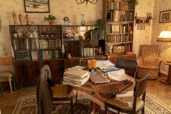
10. Intense patterns, jarring colours and even cheap materials were used to give the show a striking face and immerse the viewer in that era, even bring back old memories for the ones who lived through that Communist era.
11. “The Soviet Union as a bubble in its own right”
12. Trips to the filming locations in Lithuania and Ukraine gave the producers a sense of what the visual language of the show should be like
13. The town of Fabjoniskes was the real inspiration behind Pripyat. They used the town’s parking lots to create the green playgrounds from that era, exactly like in Pripyat
14.
15.
16.
17.

18.
19.